The Brief

The Brief

Refresh the look & feel of UI

The overall brief is to rebrand the look and feel of the UI of the whole mobile banking app

Tons of billers and biller categories

In the old app, they have two different menus of Pay and Buy where it contains tons of biller categories –– making users difficult to find the biller they want to see.

Simplifying payment flow

How can we streamline the payment flow experience despite there are specific requirements needed for a certain biller.

  1. ideation

    Streamlining Payment Feature

    Streamlining Payment Feature

    Here’s our first step in tackling this project.

    Pay and Buy Menu

    Pay and Buy Menu

    Currently we have two different menus of payment, which are Buy and Pay. Each menus have their own set of billers. There are couple of challenges from this approach:

    • Pay menu have significantly more billers compare to Buy menu.

    • If we have two menu, user might have some difficulty to find which biller that they want to complete the payment for.

    Currently we have two different menus of payment, which are Buy and Pay. Each menus have their own set of billers. There are couple of challenges from this approach:

    • Pay menu have significantly more billers compare to Buy menu.

    • If we have two menu, user might have some difficulty to find which biller that they want to complete the payment for.

    Sitemap of the old menu Pay and Buy
    Sitemap of the old menu Pay and Buy

    Show long description

    Merged to Bill Payment

    Merged to Bill Payment

    Here are the solution that we come up with to resolve the challenges:

    • Merge Pay menu and Buy menu into one giant menu called Bill Payment that cover all billers.

    • Streamline all existing billers by grouping similar billers under the same biller category.

    • Create a section of similar biller categories by their similarity, so it’s easier for user to find the biller that they’re looking for.


    *Note, during the design process there are new billers that we have to cater as well.

    Here are the solution that we come up with to resolve the challenges:

    • Merge Pay menu and Buy menu into one giant menu called Bill Payment that cover all billers.

    • Streamline all existing billers by grouping similar billers under the same biller category.

    • Create a section of similar biller categories by their similarity, so it’s easier for user to find the biller that they’re looking for.


    *Note, during the design process there are new billers that we have to cater as well.

    The new sitemap for Bill Payment menu
    The new sitemap for Bill Payment menu
    The new sitemap for Bill Payment menu
    The new sitemap for Bill Payment menu

    Show long description

solution

View Biller Categories

View Biller Categories

View Biller Categories

Here’s the new and improved bill categories. User also able to change the view between grid view and list view to help them to find biller.

Video of all billers in one screen.

  1. solution

    The New Landing Page

    The New Landing Page

    The New Landing Page

    Now that we have the biller categories sorted out, we’re moving towards the Bill Payment landing page. After much discussion, we’ve settled on this structure:

    1. Search bar

    2. Top 3 biller categories

    3. View all categories

    4. Favorite transactions

    5. List of last and recent transactions

    6. List of saved transactions.

    The page structure for Bill Payment landing page
    The page structure for Bill Payment landing page
    The page structure for Bill Payment landing page
    The page structure for Bill Payment landing page

solution

Step-by-Step Payment

Step-by-Step Payment

Step-by-Step Payment

We’ve streamlined the payment flow to this step from entry point to receipt.
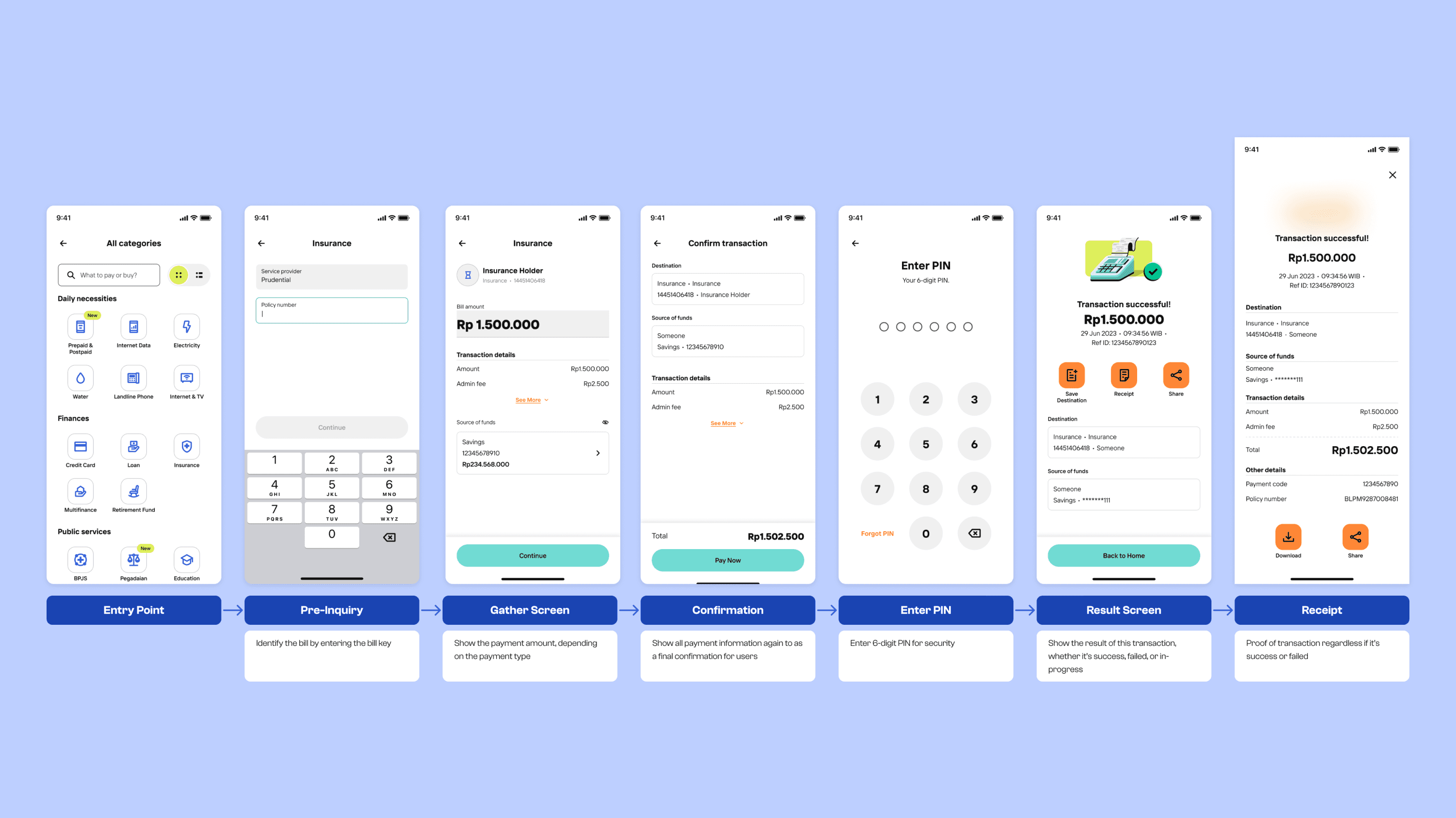
Step-by-step process on how to complete payment process

Show long description

solution

Payment Gather Screen

Payment Gather Screen

Payment Gather Screen

There are three types of gather screens based on their payment type, which are:

Open Payment Flow

Open Payment Flow

  • Open payment is when the amount input in the gather screen is editable for users by default

  • This is the example of Qurban payment.

Example of Qurban payment where the payment amount is open

Closed Payment

Closed Payment

  • Closed payment is when the amount input in the gather screen is fixed to a certain value

  • This is the example flow of paying your taxes

Example of local taxes payment where the amount is fixed to a certain nominal

Denom-based Payment

Denom-based Payment

  • Denom-based payment is when we display lots of values for user to choose from

  • This is the example flow of buying phone credits

Example of phone credits where we display lots of values for user to choose

solution

Special Cases of Payment

Special Cases of Payment

Special Cases of Payment

Other than the three main types, there are some special cases of payment, such as:

Buy Data Package

Buy Data Package

Special case where we also display the additional information of each data package

Example of buying data package where it's denom-based and display additional information for each data package

Paying Credit Card Bills

Paying Credit Card Bills

There are special case for specific credit card:

  • We can show the total bill amount

  • Because it’s open payment, user can freely enter any amount. But, in here we also add a chips that help them quickly enter the min/max amount to their credit card bill.

Example of credit card payment where we can show minimum or maximum payment amount

Takeaway

Organization is Key

Organization is Key

Working on a very massive feature is a big challenge from the get-go. I believe that having an organized file structure surely help us in the long run. Especially when the design file will be accessed by many different stakeholders (product owners, business analysts, developers, testers, etc). We always make sure that we document everything so there are no misalignment between all stakeholders involved.

Working on a very massive feature is a big challenge from the get-go. I believe that having an organized file structure surely help us in the long run. Especially when the design file will be accessed by many different stakeholders (product owners, business analysts, developers, testers, etc). We always make sure that we document everything so there are no misalignment between all stakeholders involved.

ACCOLADES

iF Design Award 2025

iF Design Award 2025

Red Dot Design Award 2025

Red Dot Design Award 2025

Webby Awards Honorary

Webby Awards Honorary